Search

Kelsee Gates

Adding my splash of creativity to the world

Photobook

This photobook is an accurate depiction of all the things I learned this semester taking Comm300 with Sister Esplyn. Before I took this class I had touched a DSLR camera maybe twice and had no idea what I was doing. But through coaching of my professors and support from my friends I learned a lot about how to use a DSLR camera.

This class has taught me how to adjust settings so that I can capture what I want to. I have loved learning how to use my camera. It has been quite an adventure learning the camera and equipment, and I admit there have been a lot of frustrations, but in the end I am pleased with all that I’ve learned.

Please enjoy my photobook! I have put a lot of hours into it, and I can hope you can see how much I have grown!

KelseeGates_cover1

Kelsee’s Photobook

Featured post

Editorial Illustration

editorial-illustration

For this project I was given an article from the Washington post titled

“A Harvard professor says he can cure aging, but is that a good idea?”

I was in charge of creating a complete illustration that could stand on its own and portray the idea. I had a brain storm session where I wrote word lists and basic illustrations. It was fun to brainstorm. Here is some from the “Throw-up Sesh”

IMG_2547I decided that I really liked the idea of “Gene Edit”. I wanted to make it tool like an Adobe program because I believe a lot of readers of the Washington Post would know how Adobe brands their programs.

So I started with the guy at the computer. It took me a while to think of how I could illustrate it without words…


kgates_editorialposter_draft

So I liked where it was going, but I knew it still needed help. Also I forgot that I could only use 5 colors! That was a bigger challenge than expected. But I went to colourlovers.com and found a nice pallet that I liked and just tweaked a tad.

When I showed my first draft to my instructor, he said the concept was good, but the illustration needed to speak for itself.

Here are some other ideas, but still not hitting it.
Screen Shot 2015-12-15 at 4.37.48 PM

How could I portray an old man being edited to a baby? Then I realized how iconic faces of old people and

Then I decided to play with the idea faces!

TA-DA!

editorial-illustration

Vector T-shirt Design

This activity was a lot of fun to plan for!

kgates-tshirt-gnome

We started off with sketching a lot of different ideas. I am easily influenced by Russian puns and really wanted to play off of that. However I realized that not a lot of people would understand. I then tried to incorporate whales and gnomes together. Here is my sketches:

IMG_2536 IMG_2538IMG_2537

I really wanted to tie in whales and gnomes together, so here is what my draft looked like

kgates_tshirt_draft

Although I liked this idea, I felt like it didn’t really convey the message that I liked. I played around with the different beard shapes and sizes, different colors, different variations.

It didn’t settle well with me, I didn’t think it would generate a lot of buzz, and was trying to tie in two ideas into one.

I then decided to play with just gnomes. My favorite gnome quote is “gnomesayin” and I decided if I designed a gnome, then it would match the message the best.

I took the hat and added more of a brim to it.

I took the belt and used it. Instead of making the shirt gold, (which looks tacky) I decided to make the shirt white and match the gnome’s beard.

I believe the gnome looks unique and spreads the message “Be yourself”

#gnomesayin?

đŸ™‚

Bike Vector

kgates_bike_final

I want to go a cruisin’ on my bike now!

Bikefinal
Bike completed 1 year ago

I took an illustrator class a year ago, and I am very impressed with how much I have improved. Let me see if I can find a picture of my first bike. I think I have improved!!

I still struggle with the bike. I think once I complete a bike that I have pride in, then I will name myself “Illustrator Ninja.” I, unfortunately, haven’t reached that status yet. That being said, I am pleased with my progress.

I had fun really putting a lot of detail into the wheels with the spokes, and grooves on the tires. I tried really hard to keep it simple, yet detailed.

The hardest part for me was the handlebars. It is hard to really do those in perspective; still learning to use the perspective tool.

Well my sketches started off very simple of a simple bike.

bike-sketches

As a worked and tried to improve my bike, it ended up like this as my first draft.


kgates_bike_draftGood, but still needed a lot of TLC and work! I completed my bike by fixing the size of the seat, adding spokes, redoing the chain, and adding a lot of touch-ups.


I am very proud of the wheels and also the gears. I hope you enjoyed as well!

Vector Timepiece

This was my second time doing this project! I feel like I learned so much more doing it the second time. Here is my wooden watch. kgates_timepiece

I am so pleased with the gradients, wood texture, and shadows! I had no idea I could create such a project! Well I wouldn’t be honest if I said that I did it by myself! It was a compilation of a lot of youtube tutorials! I owe Cory Kerr a lot of help for teaching me how to create a wood texture in photoshop and vectorizing it. His YouTube channel is so helpful!

y favorite part of my watch is the hands, I think they look so classy!

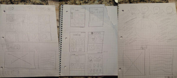
Well let me show you where I started, and where I ended up

Sketches: kgates_sketches_timepiece

(I had a secret desire to do a cat clock)

but after finding a beautiful wood watch online that I wanted to photo-reference, I decided wood it would be!

Here is the watch without any texture

kgates_draft_timepiece

It was going okay, but still needed a lot of help!

I gained feedback from students saying I was headed in the right direction, but it still looked flat. They also had a lot of problems with the size and look of the nob.

I decided I needed to fix that and also most importantly find out how to make wood!

I watched a lot of different YouTube tutorials before I decided Cory Kerr’s was the best choice.

For some humor, let’s see where I journeyed as I tried to figure out how to make wood grain:

Screen Shot 2015-11-04 at 11.22.03 AMScreen Shot 2015-11-04 at 9.16.28 AMIf you can tell, I played around with both gradients and then lines and the warp tool. Neither looked professional or like actual wood. That is when I took a wood picture and turned it into vector using Photoshop and then Illustrator.

The biggest challenge was how big the file is after you turn the wood into vector. There are millions of anchor points. I learned patience as it would like my computer 2 minutes to move any object!

Screen Shot 2015-11-04 at 12.53.25 PM

I was able to create my own texture for the face of the clock by just making very narrow ovals and repeating them a lot over the artboard. I then used the masking tool with the circular clock face.


The biggest success of this project was the fact that I learned how important being organized in your layers pallet is! This was the first time I kept up with it, and it worked like a charm! đŸ™‚

Vector Website Design

finished
Behold the finished product! The task for this project was to take all the text and images that I had on the blog post for my icons and make a vector based website. I was up for the challenge because, as mentioned before, I love Under the Sea themed things!
I decided to design my website for an aquarium company, using my icons as the buttons you press to learn more about the exhibits.

sketches-together

I have to say a lot about sketching on this assignment, because I know my design would not have looked how it did, had I not sketched first. I know this is true, because when I was drawing, I came up with waves as shown in the picture below. When I tried to transfer that to Illustrator, I could not figure it out! The waves looked like ugly rounded triangles, and nothing like i wanted. I tried a lot of different methods. The waves featured on the final draft came as a result as I put circles together and noticed those looked like waves. Success!!

kgates_wireframe
I then had the waves and the bubbles touching, but when I accidentally moved the waves down, I loved how that looked! Plus the words looked even better above!
I then decided to have the icons move up when we are on that page. It took me a while to get the right distance, but then I was able to figure it out.

I love it when websites are divided into sections by color, so I took the theme of ocean blue, a light blue, and a white to distinguish the different sections.

My page was still lacking depth, and so I added a drop shadow. At first it was way too bright, but after using a blur feature and hiding it mostly behind the images, I was able to give depth without distraction.

When I brought it into illustrator for a wireframe, I ran into more and more problems, but none of which were unsolvable, some just took a long time to figure out.
I enjoyed designing this, and hope to incorporate more of my designs into websites!

Here is a website that I coded completely from scratch using HTML and CSS.
I created the website because I have a passion for Russia and served a volunteer church mission for a year and a half there in Vladivostok. This website was to inform other girls about how to best prepare.
Currently hosting this website through Bluehost
http://www.simplerussian.com

Under the Sea Icon Set

The final draft

kgates_icons_final1

How this project came to be…. Well…
I love Mermaids! Why? Well it could help that I work for a mermaid company! I love anything related to Under the Sea because it has become a passion and an interest for me.

When thinking about this theme, I wasn’t sure which way I wanted to take this project. I started sketching and realized I could take a fun kid’s theme or more of an elegant “Under the Sea” theme. When working more and more, I realized that I really wanted the sea animals to come alive!

IMG_2223

The rough draft was… rough! I didn’t love it, I was frustrated by trying to decide whether to use the pen tool or the brush tool! Plus a major hangup was trying to learn how to change the color of a stroke. (Thanks to Google I now know you have to expand the stroke).

icons_draft

After a lot of struggle with illustrator I realized that although my designs were themed, the shapes were not uniform. I got stuck again.
icons

After a lot of struggling, I decided that I wanted rounded corners to play off the theme of kids. I added a stroke to cut the shapes a part to give them more uniformity. I also added a giant smile and big eyes on a lot of them.

These icons taught me a lot about building with shapes and erasing the 50 billion unwanted anchor points.

Enjoy! Happy Swimming!

Print Contest!

dougluckyguyjpgI created this photo by having girls holding up horseshoes in different poses while my friend Doug stood still. I then took in into Photoshop and masked the unimportant parts out, so that you could only see Doug and the horseshoes and not their fingers holding up the horseshoes.
I then went to CG textures and picked a sparkler texture to overlay because I wanted it to look like the horseshoes were magical. I like that the sparkler was in a circular shape because then it adds an air of magic.
I chose to enter this contest because I am a member of the Photographic’s Society and I have been going all semester and seeing the marvelous photos that people create, and I wanted to see if I could have a chance at winning!

http://www.byuiphotographics.org/contests/print-contests/

I submitted the contest March 31, 2015

Create a free website or blog at WordPress.com.

Up ↑